
- UX / UI Design
- Shopify
- Ecommerce
SanStand Shopify eCommerce Website Case Study
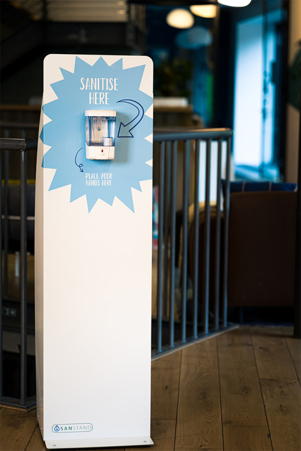
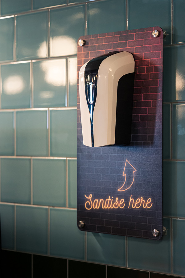
Flourishing during the COVD pandemic to meet the mushrooming market for hand sanitizer SanStand is now the market leader of branded sanitiser stations. SanStand offers businesses the opportunity to customise sanitiser stations for a huge range of market sectors, from education, factories and offices to pubs, restaurants and nightclubs.
What we did
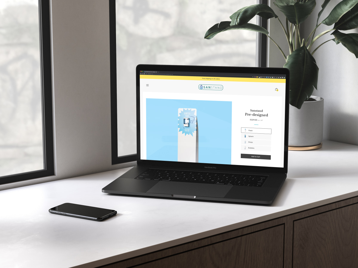
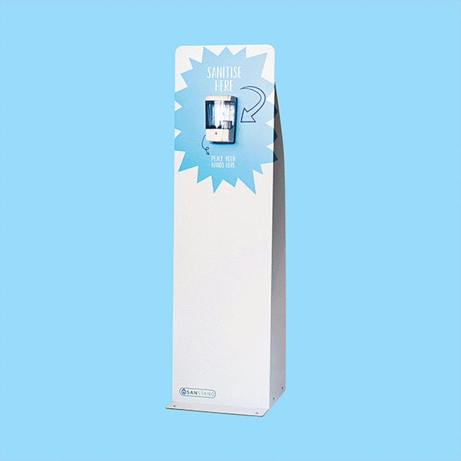
By reviewing and simplifying the customer journey, we have created a streamlined and product focused website for Sanstand. We selected a Shopify theme to showcase the USPs of SanStand bringing the features and qualities of the products to the fore. With a potentially confusing number of features and customization options the product pages now clearly outline and define the product options available. The website now reflects the quality and features the SanStand products offer as well as the full range of customization options available.
Bespoke Product Pages
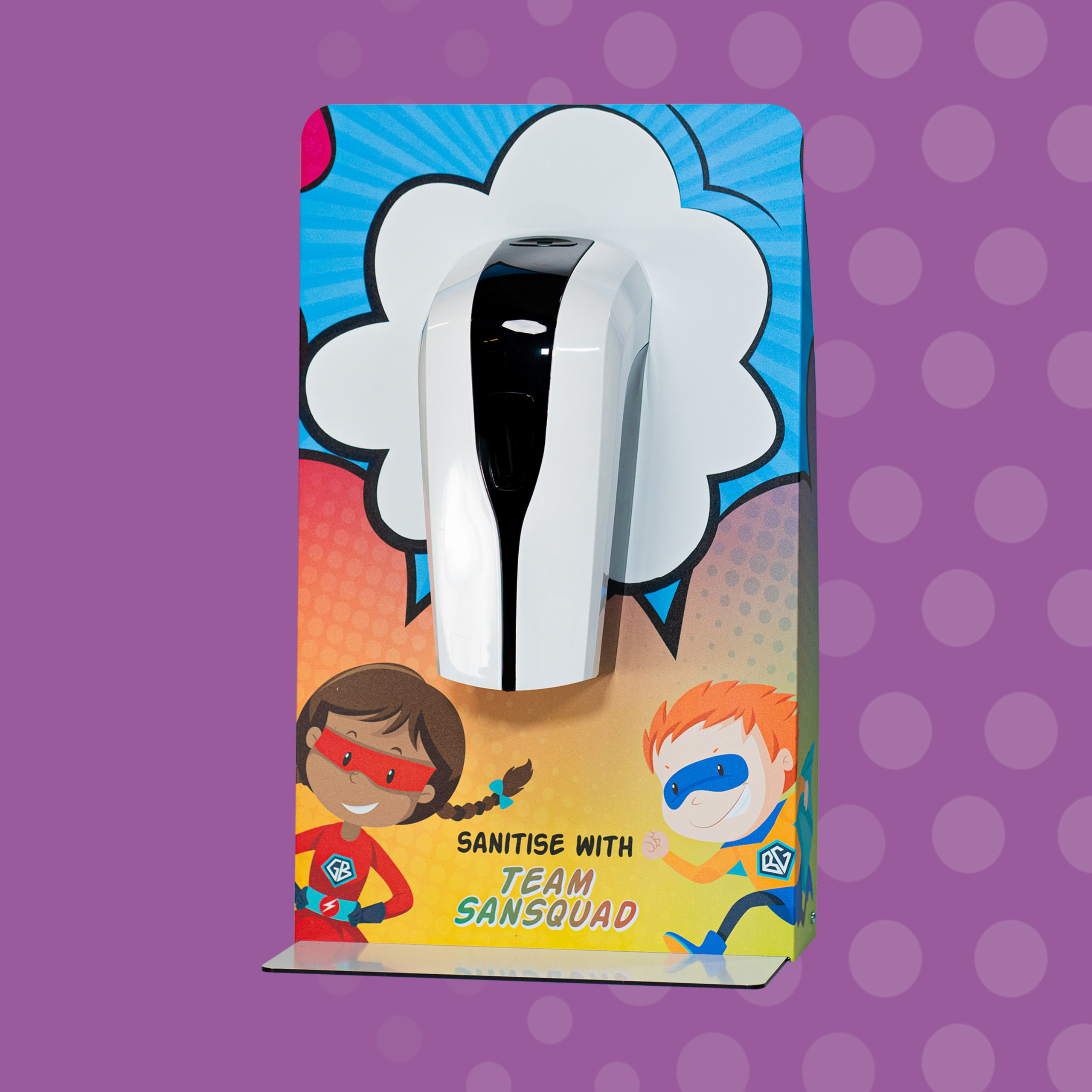
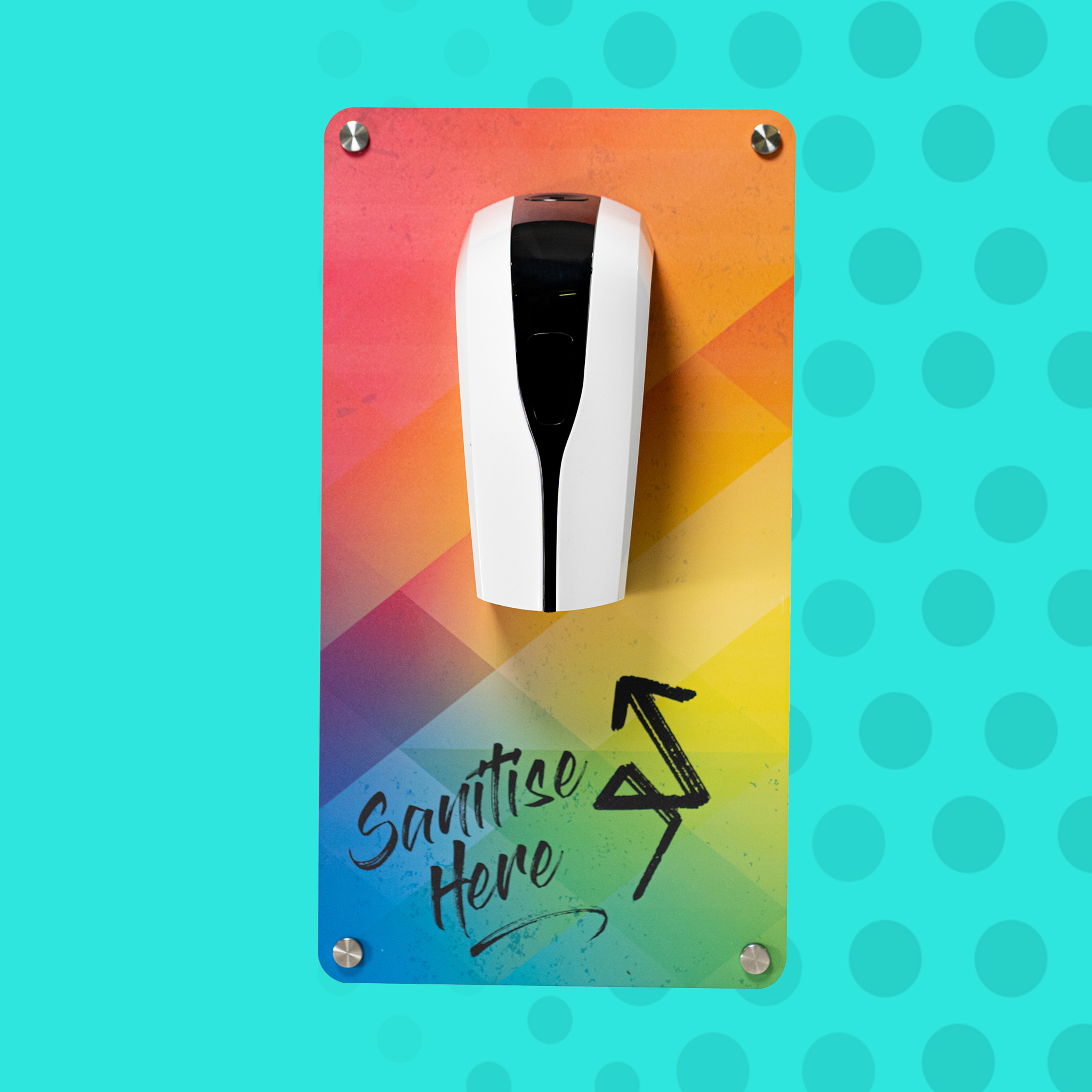
As market leaders in B2C branded sanitiser stations, StandStand needed a number of their product pages enabled with the functionality for customers to upload design files. We implemented this across a number of products, adding clear guidance on steps to customisation and purchase. We also integrated functionality to calculate artwork charges, including discount by volume, specific to product type. Accurate artwork fees are now applied at checkout to ensure the customer has clarity on all costs upfront. SanStand products have a number of design options and features, the understanding of which are integral to customers making the correct purchasing decision. We created a set of bespoke icons to visually represent these features. These icons sit beneath the product image on each product page to highlight the benefits of all SanStand options to their customers.
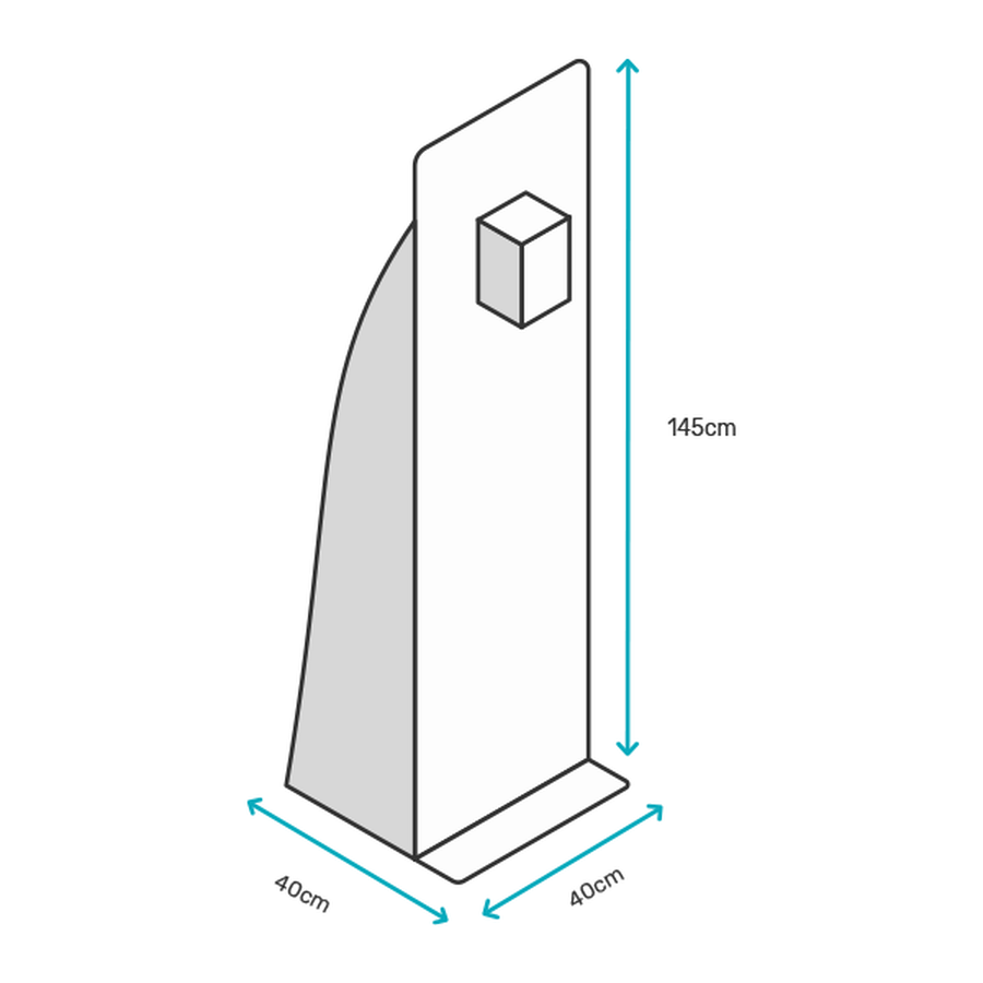
Illustration Concept & Direction
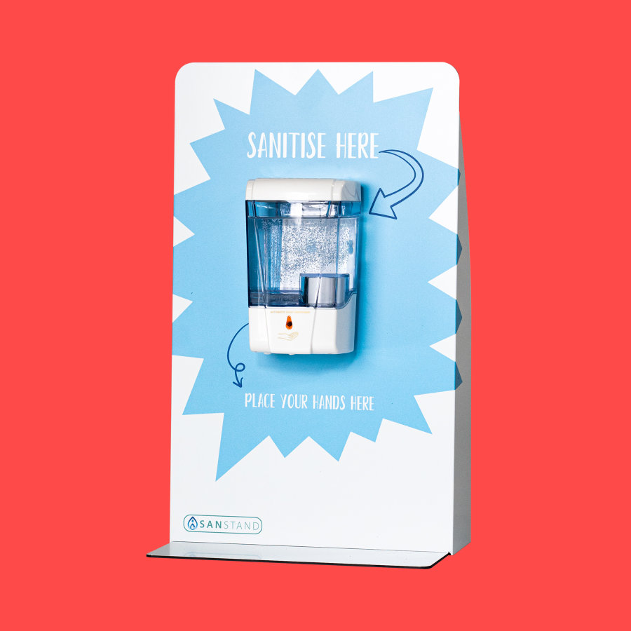
Demonstrating clear and immediate differentiation between SanStand products was one of the key goals for our client. The addition of vector line drawings to each product page is an efficient and effective way to simplify the user journey, and enable the user to accurately explore the range and dimensions of products available.
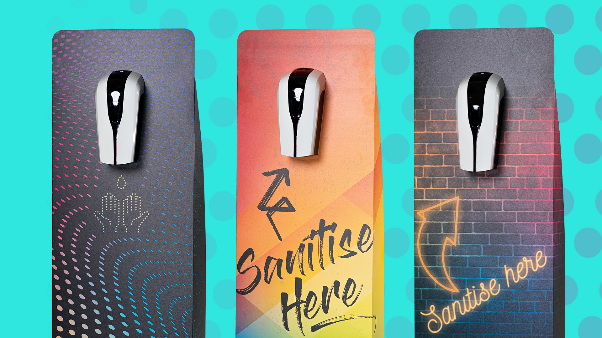
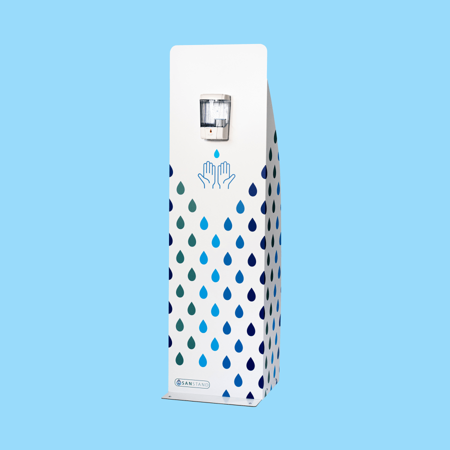
Product Imagery
We implemented a fresh new colour palette across the site. Each collection is presented in a different colour to help the user distinguish between the products.

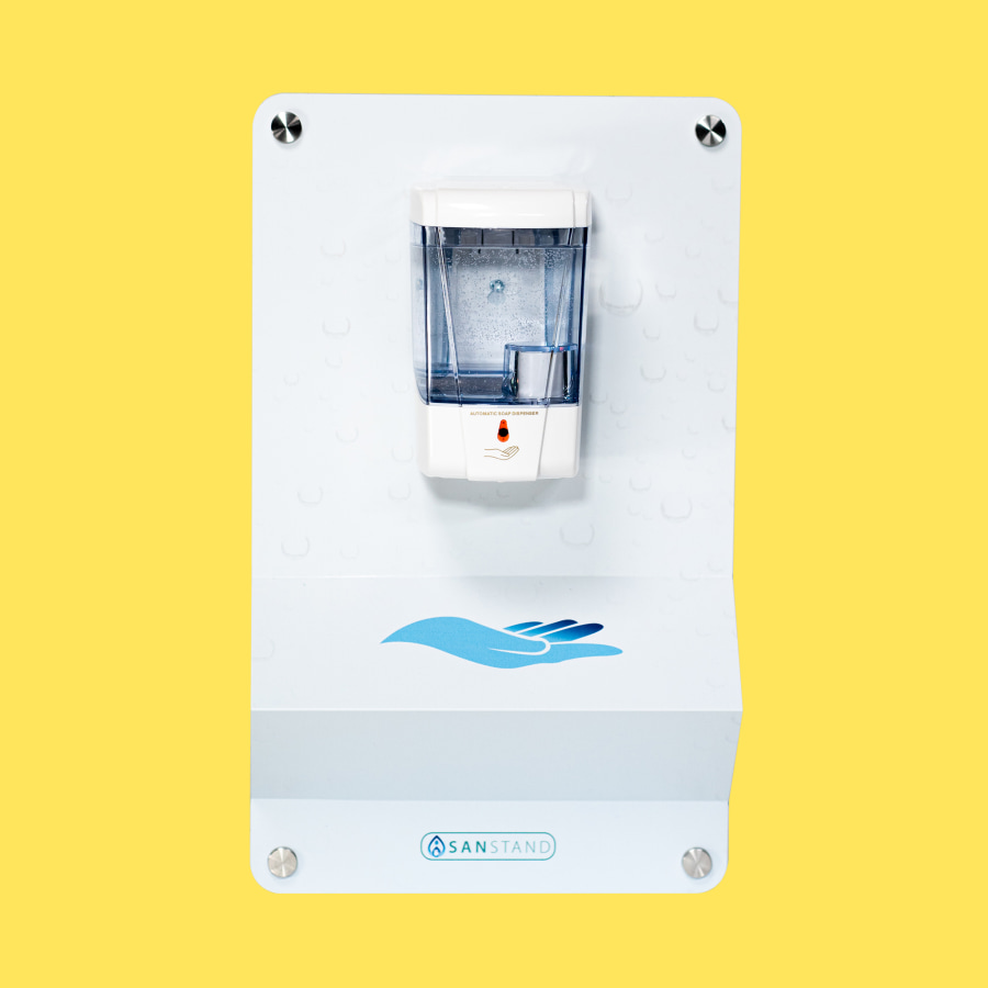
Bespoke iconography
The Dewsign team is experienced in design and branding, recognising this our client gave us creative control to update their branding. We chose to showcase the quality of Sanstand products with a new typography, colour palette and bespoke product icons to represent a number of product features. These icons sit beneath the product image on each product page to highlight the benefits of all SanStand options to their customers.