
- Strategy
- UX / UI Design
- Bespoke software
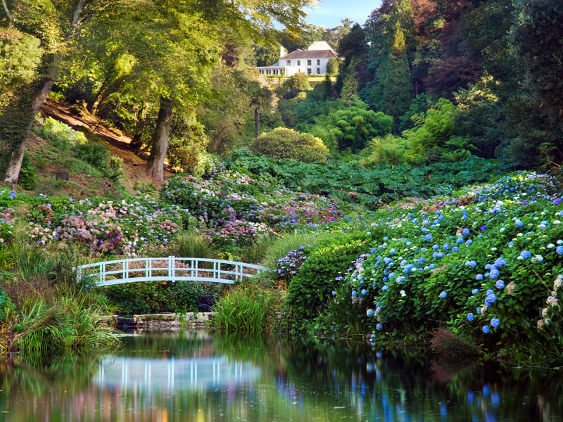
Trebah Garden Case Study
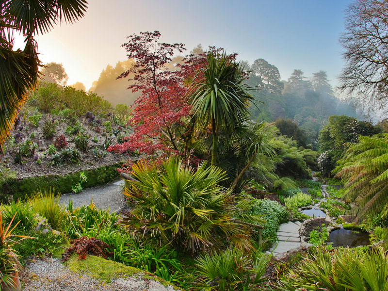
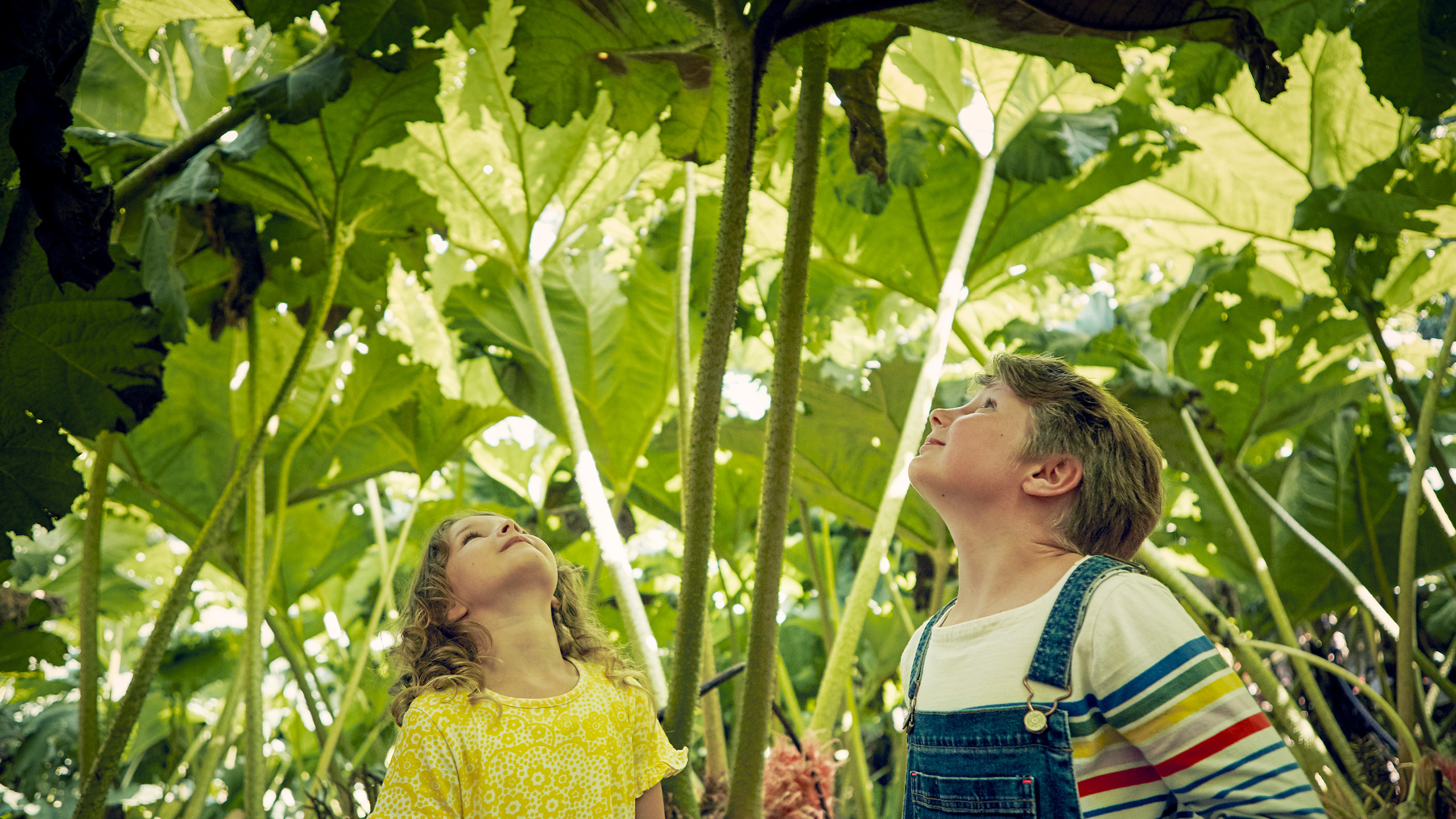
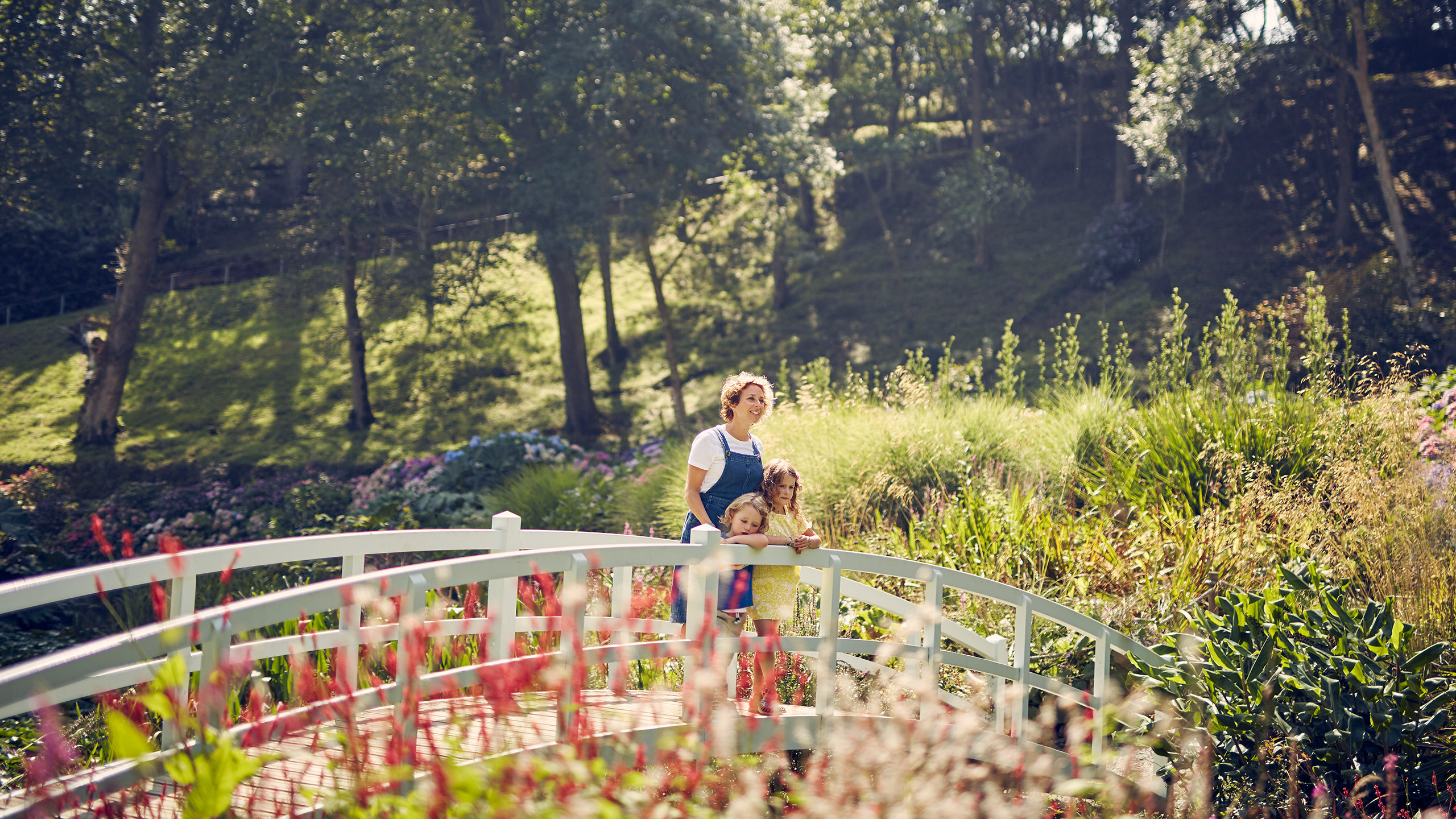
Trebah Garden is a subtropical paradise set in a beautiful Cornish valley running down to a private beach on the Helford river. One of the Great Gardens of Cornwall, Trebah offers visitors a visual feast in every season. Showcasing the year-round appeal of Trebah to drive visitor numbers and revenue through ticket sales was at the core of the brief. The result? A stunning bespoke image-led, mobile-first web experience built in Laravel.

What we did
Dewsign’s tried and tested approach to web design begins with an in-depth consultation to kick off the UX process. Good UX design will ensure a website meets the exact needs of a customer intuitively; streamlining the user journey with all key information at their fingertips. Our UI design development process followed creating a clean, modern look and feel with bespoke iconography and colour palette.
Simplifying & creating an accessible experience
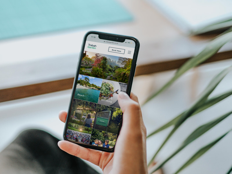
The historic Trebah Garden website hosted a lot of great content but was difficult to navigate and not mobile-friendly. Our mobile-first process and user-testing led to a refined website structure which enables users to locate the information they need far more intuitively and in far fewer steps.
Understanding your users
Developing user persona’s is key to our user experience (UX) approach. We undertook a workshop with Trebah to define four key user personas and their respective needs. This information is invaluable in informing how we solve problems and provide solutions in the user experience phase.

Streamlining the user flow
Following the strategy work, development of user personas and revised site map we streamlined the user flow, grouping the existing content in the key areas of navigation; Visit, What's On and Find Us. Direct access to the booking portal via ‘Book Now’ was added to the main header navigation.
User experience design
The UX process for Trebah was focused on solving two key issues, making the experience informative and image-led. We used the personas and user flow to map out content blocks and styles required to build the site within our bespoke Laravel CMS ‘repeater’ system.
A visual showcase
How do you solve all of a user’s questions as quickly as possible? By developing a bespoke smart gallery grid. This unique Laravel functionality underpins the great user journey on the site. Not only allowing the user to find answers visually but also highlighting relevant information they might not (yet) be looking for too. All in one quick scroll.
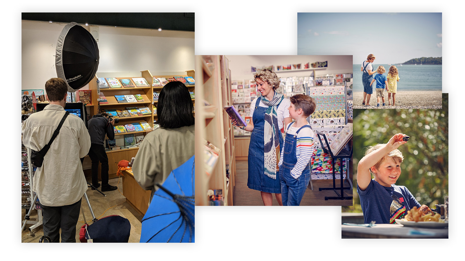
Photoshoot
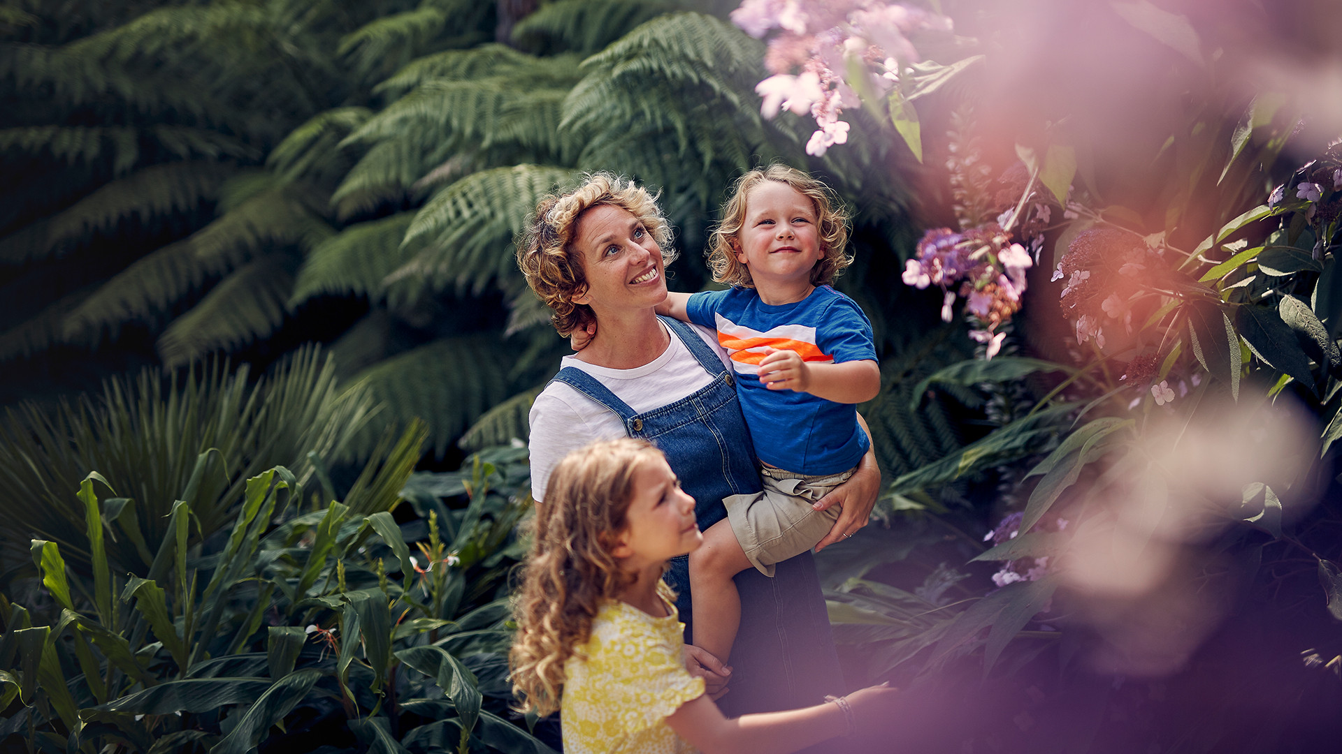
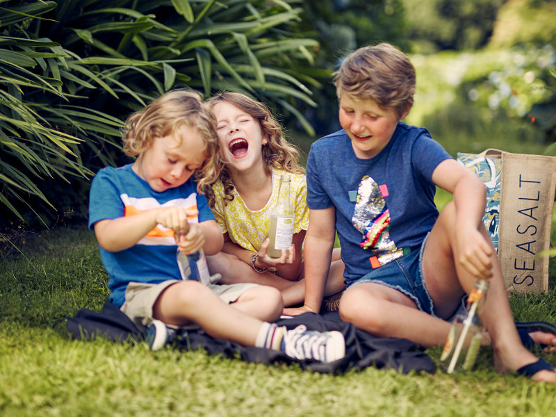
There’s more to a successful shoot than meets the eye. For Trebah we managed all elements of photography in-house. Pre-production included defining the brief, sourcing the right photographer (the talented James Bannister http://www.jamesbannister.co.uk), conducting a location recce, building a shot list and briefings. Shoot day brings overseeing all elements of production, models and art direction to ensure that all required images (and more!) are in the bag.
User interface design
Only when the UX design is approved is the UI design undertaken. Using space to our advantage, we created a clean, modern and accessible interface to ensure each user journey is as intuitive and seamless as possible. We created a 12 column grid for the desktop which collapsed to a 4 column grid on mobile.


Bespoke iconography
We created a bespoke suite of iconography - from handy functional icons for email, downloads and signposts arrow to a neat geometric flower favicon.
Scales up not down
Going against the grain! The responsive nature of websites always used to be about responding down. Our mobile-first approach took us to view the design of the site in a whole new way. Instead of looking at elements that respond down everything responds up. Giving a full-screen immersive experience on both mobile and desktop.
Global CMS Properties
For this build, we wanted to try and minimise the amount of data that the client had to enter multiple times. Specifically, the different opening times and price lists of various areas/attractions at the garden, as these data types would appear at multiple locations site-wide in the sidebar. By allowing the client to define opening times and price lists away from the page content, it creates a central source of truth for these items, that when updated once, reflect everywhere they are pulled in across the site. No more hunting down each and every page that displays the Gift Shop opening times for a one-off short day, and consequently having to do the same to change it back. We love simple, and we love saving time for focusing on the fun stuff.
Year in flower/scent
Like all gardens, the botanical highlights at Trebah change with the seasons. We developed bespoke functionality in Laravel to ensure the user is shown relevant content without changing their user journey. When navigating to /year-in-flower we run some backend magic to grab the current month and route the user to the correct month page. Small interactions like this may well go un-noticed by the user but really help to ensure a seamless and enjoyable experience across the site.


No more image slicing
Our clever auto-cropping ensures images are sensibly cropped across all devices and also allows more flexibility with UI design. For instance a 16:9 hero image can be auto-resized to a square image or a 6:4 image, saving our clients a lot of time (that can be used in other areas instead!).
Accessibility
By highlighting event dates within a white box over the image, we created neat little groups of content which are super accessible and user-friendly for fast scrollers on mobile. It’s the little things that make all the difference!
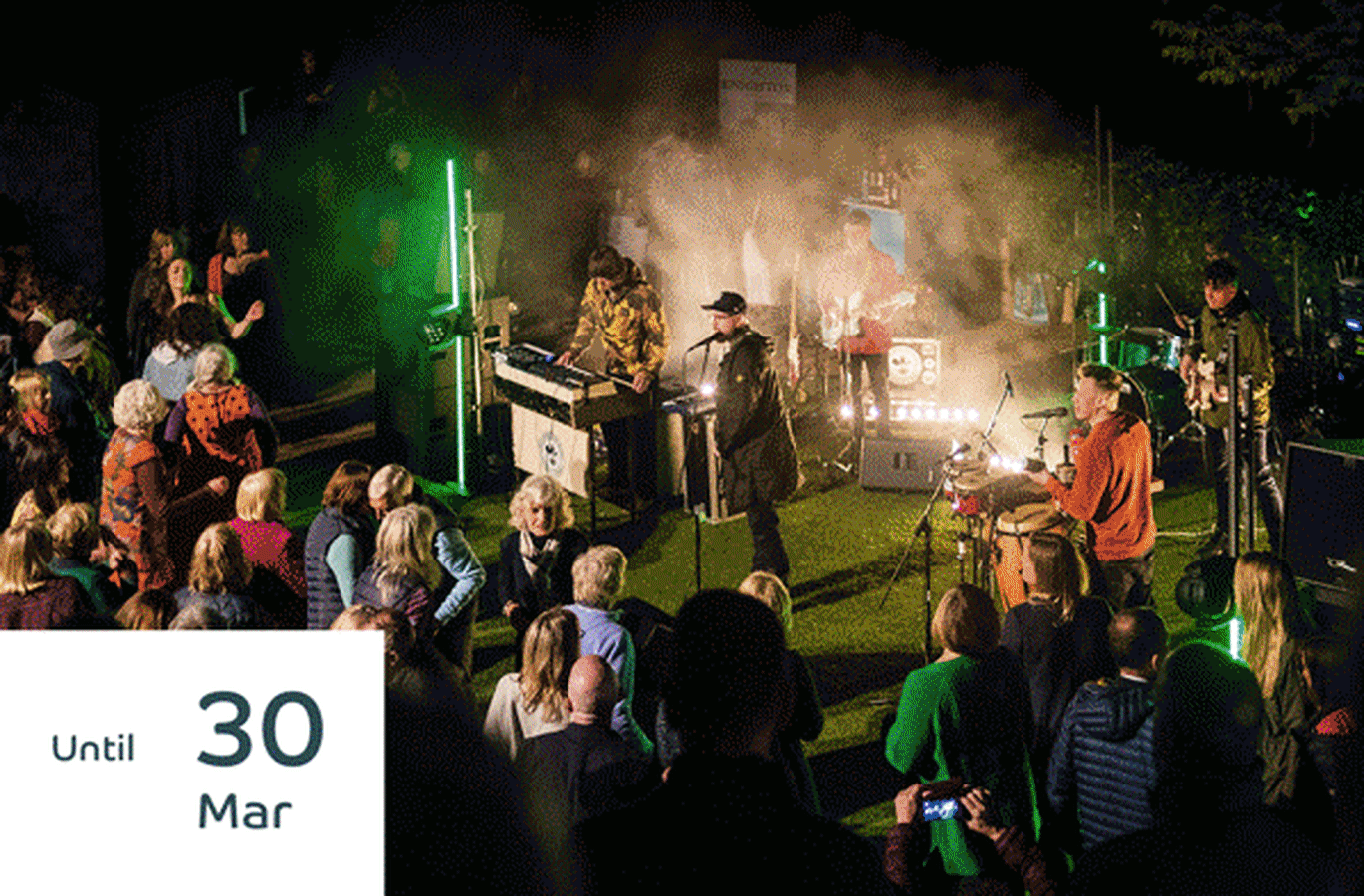
Email marketing
We designed and built a fully bespoke email template integrated with Mailchimp. We developed a further three tailored templates for key points in the year to drive interest and visitor numbers with compelling timely content.
Seasonal - Sent 4 times a year. Highlighting upcoming events and garden highlights for Spring, Summer, Autumn and Winter.
Bloom - A newsletter for spontaneous newsletters to highlight key blooms that only hang around for a few weeks like the stunning magnolias or rhododendrons that blanket Trebah in the spring. A sure-fire way to increase awareness and drive footfall for loyal garden visitors.
Event - A template developed to house more detailed information about specific upcoming (ticketed) events. Linking directly to the booking portal simplifying the user journey to drive sales.
The final cut
The final homepage video edit ties together stunning visual content to really showcase the best of Trebah. A specifically proportioned video was also created for mobile.
Working with Trebah was a huge project. The following three concepts were developed but didn’t make it to the final website iteration. However, we’re proud of them and we wanted to share some the creative process projects like this can go through, and how some great ideas can be developed but don’t always make the final cut.
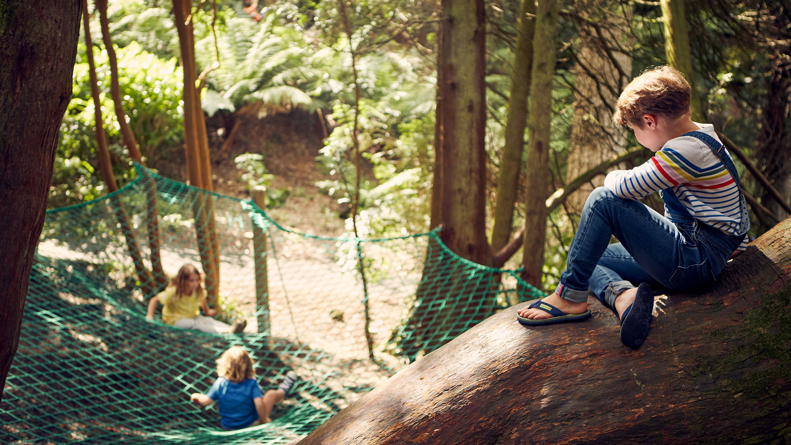
One of the key user personas developed was the family on holiday in Cornwall, who could be likely to be staying on a campsite without enough signal (or data allowance) to load a large visually exciting video. With this in mind we developed an immersive image concept, user-controlled by scrolling or tilting dependant on the device. Whilst requiring bespoke development, this homepage option would have used a lot less data for mobile users and would have encouraged the user to interact with the site on a deeper level.
Immersive desktop concept
Loading into an image of the showstopping view from the top of Trebah Garden. The user would be able to scroll and literally 'take a closer look' into the garden.
Immersive mobile experience
Using the same concept as the desktop we could have utilised accelerometer-based viewport, where the user could have tilted and interacted with the stunning view to truly showcase the view down the valley at the heart of Trebah.


